(单词翻译:单击)
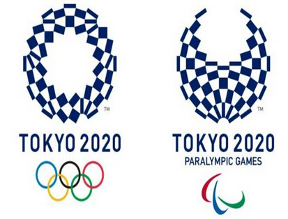
Japan's Olympic organisers have unveiled the new official logos of the 2020 Tokyo Olympic and Paralympic Games.
近日,日本奥运筹备委员会发布了2020年东京奥运会和残奥会的官方会徽。
The logo, called Harmonized Chequered Emblem, replaces the first choice which was thrown out last year after the designer was accused of plagiarism. The designer denied stealing the idea.
新会徽被称为“組市松紋”,代替了先前发布的第一个会徽图案。据悉,该会徽的设计者被指控抄袭。不过该设计者否认自己在创作中存在抄袭。
Organisers said the new design used traditional Japanese colours and patterns to represent the intercultural themes of the Games.
奥运主办方发表声明称,此次的新会徽使用了日本传统的色彩和符号,以此来展现奥林匹克跨文化的主题。
"It incorporates the message of 'unity in diversity'," they said, and the idea that the Games "seek to promote diversity as a platform to connect the world".
主办方表示,“新会徽同时体现了'统一性和多样性'的理念”,而且还很好的诠释了奥运会作为连接世界的舞台,从而促进多样性的作用。

When designer Asao Tokolo found out he had won the re-opened contest he said "my mind has gone blank. I put a lot of time and effort into this design as though it was my own child."
当设计师野老朝雄得知他在重新开始的会徽征集大赛中脱颖而出的时候,他说:“当时我的大脑一片空白。我在这个设计中倾注了大量的时间和心血,它就好像我的孩子一样。”
The Games organising committee never agreed to the allegation of plagiarism but said there were too many doubts over the emblem for it to be used.
此外,主办方没有承认第一次的会徽涉嫌抄袭,但发表声明称,因外界针对该会徽存在太多疑问,所以决定不会使用它。
The logo dispute came shortly after Tokyo decided to scrap the designs for the main Olympic stadium because of spiralling construction costs. A cheaper design, by Japanese architect Kengo Kuma, was chosen in December last year.
此前由于不断上升的建筑成本,日本放弃了最初的奥运主场馆设计,而随后便发生了围绕会徽的纠纷。在去年12月,主办方选择了一个由日本建筑师隈研吾设计的更为低廉的建造计划。


