(单词翻译:单击)
Logos—we see hundreds of them every day. We see them so much that we often don't even think about them. But years of work and millions of dollars go into even the simplest logos, and sometimes the layers of hidden meanings can be hard to believe.
我们每天都能看到成千上万的logo,却从来没有想过它们背后又有什么深刻的含义。但是这些看似简单的logo却是人们投入了大量的金钱和心血所创作的,并且有些logo还蕴含着令人难以置信的意义。
10.Fedex Logo Subliminally Tells Us They Are Fast
10.联邦快递的logo 告诉我们他们是最快捷的

The Fedex logo is basically just the company's name: "Fed" in bold purple writing and "Ex" in bold orange. There's nothing particularly clever about that. So why has such an unassuming logo won dozens of awards? For its use of negative space. In the FedEx logo, the "E" and the "x" are positioned in such a way that an arrow is formed in the space between them. A lot went into the creation of this logo, including months of work and the creation of an entirely new letterform. But what is represented in the logo is apparently very effective on a subliminal level. Many don't specifically notice the arrow but still process it on an unconscious level, associating it with the sense of speed and proficiency that the company certainly hopes to be linked to.
Fedex(联邦快递)的logo其实只是一个简单的公司名字:"Fed"是用紫色绘出的,而"Ex"是用大胆的橙色。这个logo的设计看似没有什么聪明之处。那么到底是什么让这个logo设计可以获得那么多奖项呢?这个logo设计的巧妙之处在于对负空间的高度利用,在联邦快递的标志中有这么个细节,E和x之间的负空间组成了一个向右的箭头。为了这个logo的诞生,设计师们投入了数月的心血,甚至融入了一种全新字体形式的创造。但是这样的投入显然是值得的,人们在看见这个logo的时候在潜意识里就明白这个logo所要表达的意思。虽然大多数人并不会特别去注意那个箭头,但是在大脑的潜意识里依然会受到影响,接收到联邦公司希望传递给大众的快捷和发展精神。
9.The Golden Arches Are Boobs
9.麦当劳的金色拱门logo居然是乳房

One would be forgiven for thinking that the McDonald's logo is nothing but a large yellow representation of the first letter in the company's name. And it technically is, but there's more to it. To some, the rounded "M" subconsciously represents our mother's breasts. In the 1960s, McDonald's was retooling its image, which included discussing a possible new logo. Louis Cheskin, a psychologist and design consultant hired by McDonald's urged them to keep the current logo, claiming that the golden arches had a Freudian effect that made customers imagine a pair of nourishing breasts, which then made them hungry. Some find this hard to believe, but one thing's for sure—you won't look at the big "M" the same way again after today.
人们看到麦当劳的logo时总是会不假思索地认为麦当劳标志只不过是表示公司名字首字母的黄色M。其实它还有更多的含义,一些人会下意识地认为圆形的"M"代表我们母亲的乳房。在1960年代,麦当劳重塑其形象,讨论了一些可能的新logo。麦当劳渴望能够保持现有的logo,于是麦当劳雇佣了Louis Cheskin——他是一个心理学家同时也是一个设计顾问。并且声称这个金色拱门是一种弗洛伊德营销,可以让顾客看到这个logo会想到是一对滋养的乳房,让客户感到饥饿。这些发现令人很难相信,但是可以确认一件事——那就是如今你不会看到这个大"M"而想到同样的事情。
8.Museum of London Logo Shows History
8.伦敦的博物馆logo展现了历史

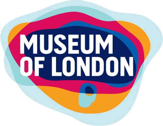
The Museum of London is dedicated to recounting the history of London through all eras, from medieval times to today. In 2010, the museum needed a revamp, hoping to update their image and appeal to a younger audience. The new logo they presented was certainly capable of that due to its vibrant color, but on top of that you can learn about the history of London just by looking at it. The logo features several colored layers, each representing a different geographical shape London has taken in its evolution through time. This reflects the history and change that the museum displays and documents inside, as well as being almost impossible to miss due to its color.
伦敦博物馆致力于讲述伦敦从中世纪到今天的所有历史。在2010年,这个博物馆决定转型,希望能够改变它一直以来给人们的印象并且吸引到更多的年轻人。于是一个新的logo诞生了,它充满活力的色彩表达了它的可用性,但是最重要的是你可以通过观察它就能了解到伦敦的历史。这个logo的特点在于它的色彩有很多层次,并且不同的地理形状分别讲述了伦敦的发展史。它反映了博物馆所要展现的历史和变更,除了这些以外,它的色彩也是不容错过的精彩。
7.Adidas Logo Makes You Work Harder
7.阿迪达斯的logo激励人们去努力

Adidas manufactures sports clothing and accessories, but it's probably most known for the shoes. The name "Adidas" originated as a combination of the first and last name of the company's creator, Adolf Dassler. Even at the very beginning, Adidas put heavy interest into marketing, with "the brand with the three stripes" almost becoming their motto. Throughout time, the company's logo has changed, but has always incorporated the three stripes. The current logo features three slanted stripes in a triangle shape, but referencing the logo of times past isn't all that's represented here. This new logo symbolizes a mountain, a metaphor for the challenges and perceivable goals that all athletes must meet and overcome.
众所周知,阿迪达斯主要生产运动服装和配饰,但是它最著名的产品应该是运动鞋。"Adidas"这个名字源于阿迪达斯公司的创始人阿道夫戴斯勒(Adolf Dassler)的姓和名的组合。从一开始,阿迪达斯就投入了大量的成本花费在市场营销上,甚至"三条纹品牌"几乎成为了它的座右铭。随着时代的变迁,公司的logo也发生了改变,但是总会包含"三条纹"。目前的logo是将三条纹以三角形的形状呈现,但是过去具有代表性的logo却没有完全体现在这个logo中。这个新的logo象征着一座大山,一个隐喻的挑战和可感知的目标,这个logo告诉所有的人们必须做好接受挑战的准备,克服一切困难才能达到这个目标。
6.Mitsubishi Logo Shows Company Lineage
6.三菱标志象征了公司血统

Mitsubishi was first established as a shipping firm in the 1800s and involved the merging of two groups to become one company. The logo represents this by combining two "crests"—the three-leaf crest of the Tosa Clan and the Iwasaki family crest, which showed three diamonds stacked on top of each other. The three diamonds are said to signify reliability, integrity, and success and are colored red because red denotes confidence and attracts customers to the brand.
三菱的前身早在1800年的时候还是一家船厂,后面和另外两家公司合并之后成为了一个公司,也就是现在的三菱汽车公司。三菱的logo是岩崎家族的家族标志「三段菱」和土佐藩主山内家族的家族标志"三柏菱"的结合,后来逐渐演变成今天的三菱标志,以三颗菱形钻石为标志。据说这三颗钻石意味着可靠、完整和成功,并且底色为红色,因为红色代表自信,并且能够吸引更多的客户。
翻译:曹秋会 来源:前十网


