(单词翻译:单击)

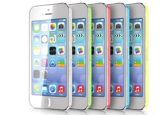
Apple: go slow on that tutti-fruiti thing! The first survey data is in and Apple fans may not be thinking as differently as the company expected. The Polar polls on the topic of “ iPhone colors” has brought into question Apple’s colorful approach to the new iPhone launches.
苹果请注意:先别急着推出缤纷水果色的东东吧!第一份相关调查数据已经出炉,果粉可能未如苹果公司预期的那样口味各异。Polar公司对“iPhone色彩”这一话题进行的民意测验表明,苹果在新版iPhone的发布中采取的多色彩策略是否奏效,尚存疑问。
As of last night, Luke Wroblewski from Polar told me that they had, “ collected 6, 811 opinions from about 1, 100 unique voters.” Based on the current results, it appears that among the bright colors for the iPhone 5C, the order of preference is cyan, lime, banana and melon. But in polls between the bright colors and white, white wins by a 3-to-1 margin. Similarly, for the more sophisticated 5S palette, black is the clear winner over silver, but both black and silver win by almost a 4-to-1 margin over champagne/gold.
前天晚上,Polar公司的卢克•罗博乌斯基(Luke Wroblewski)告诉我,他们“收集了约1,100位独立投票者提交的6,811个答复。”基于当前得出的结果,看起来对于iPhone 5C所采用的鲜艳色彩来说,人们的偏好依次是宝石蓝、青柠绿、香蕉黄和西瓜红。但民意测验还显示,在鲜艳色彩和白色中,白色以3:1的比例胜出。同样,对于更为精致的5S配色,黑色明显比银色更受欢迎,但黑色和银色双双以约4:1的比例胜过香槟色/金色。
My current tallies for the 5C show Lime 497 vs Cyan 772; Banana 640 vs Melon 544; White 836 vs Cyan 308; and White 250 vs Banana 87. For the 5S I show Black 951 vs Champagne 253; Black 681 vs Silver 531 ; and Silver 913 vs Gold 257.
我当前得到的各种颜色5C的得票数为:青柠绿497;宝石蓝772;香蕉黄640;西瓜红544;白色836,宝石蓝308。而对5S,我得到的数据是黑色951:香槟色253;黑色681:银色531;银色913:金色257。
What’s going on here? It is possible that the sample size is not large enough to be significant or skewed in some way. More likely though is that the data reveals the essential conformity among iPhone users. Most of us don’t want to stand out. This is where Apple’s marketing around the color choices will be interesting.
这是怎么了?可能样本量不够大,因而得出的结论不具有统计学意义,或者说在某种程度上是有偏颇的。然而更有可能的是,数据揭示了果粉中最根本的一致看法。我们中大多数人并不希望如鹤立鸡群般抢眼。这就是苹果围绕色彩选择所采取的市场营销策略中,颇让人感兴趣的地方。
It is possible that once the colors get out there in the wild that people will be more comfortable with the new choices. One would imagine younger people being more attracted to the bright colors and the fashionable to the gold. Hopefully Apple’s quantity orders are in line with consumers’ initial preferences and will expand with their interest.
一旦这些缤纷色彩出街,人们对这些新的选择会更加适应,这也是有可能的。我们猜测比较年轻的用户会更爱鲜艳的色彩,而时尚一族会选择金色。不过幸好苹果的订单量会与消费者最初的偏好保持一致,随着他们感兴趣程度的上升再扩大投放市场的数量。
There are many ideas about where the ne bright palette come from. I suggested Kandinsky and the early abstractionists yesterday, others have pointed to the Windows Phone. Wroblewski, father of a small child, has found a unique reference point: the Hungry Hungry Hippos game! So far though Polar voters find this connection more likely a “coincidence” than a specific “design intent.”
对于这些明艳配色的灵感源于何处,人们有着很多看法。我认为源自康定斯基(Kandinsky)和早期的抽象派艺术家,其他人则指出是Windows Phone。已有一个小孩的罗博乌斯基则找到了一个非常特别的参照点:《饥饿的河马》(Hungry Hungry Hippos)游戏!而眼下来说,Polar民意测验的投票者认为这种联系更可能是一种“巧合”,而非有意的“设计意图”。


