(单词翻译:单击)
Say you've written a list and gone to the store.
假设你写了一份购物清单然后去了商店。
But you quickly start buying things that you didn't plan on.
但你很快就开始买那些你根本就没打算要买的东西。
After all, fresh produce would be nice.
毕竟,买点儿新鲜的农产品也没什么不好。
And these look good.
而且,这些东西看起来也不错。
Half off? Why not!
还打五折?干嘛不呢!
Wait. Why is it so hard to stick to a shopping list?
等等。为什么坚持购物清单这么难呢?
Researchers estimate that half of consumer spending is unplanned.
据研究人员估计,消费者有一半的消费活动都是计划之外的。
Sometimes it's stuff you just forgot to put on your list.
有时,这些东西只是你忘记加入清单了。
But there's another kind of purchase that consumer psychologists measure.
然而,消费心理学家们还观察到了另外一种消费行为。
"That would be your impulse purchase where you see something, you think 'it's kind of a cool item, I think I'll, you know, buy that'."
“那就是‘冲动性消费’,也就是大家在看到某个东西时就会想,'这个东西不错啊,买了'。”那种消费行为。
The architecture of a store can impact consumer satisfaction, which in turn might spur impulse buys.
商店的布局会影响消费者的满意度,反过来便可能诱发冲动性消费行为。
In the 20th century, the architect Victor Gruen used light and space to dramatically stage goods in storefront windows.
20世纪的建筑师维克多·格鲁恩就曾利用光线和空间将商品大量陈列在橱窗里。
His designs tried to capture the attention of passersby and convert them into customers.
他的设计旨在吸引路人的注意力,进而将路人转化成顾客。
Today, people refer to this as "The Gruen Effect".
今天,人们称这种技术为“格鲁恩效应”。
It happens when a store environment takes you from shopping for a specific item to shopping for shopping's sake.
当店铺环境将你从为了某一个东西而购物变成为了购物而购物时,就种效应就发挥作用了。
It's about the mindset and the environment that they try to create.
商家们主要是为了营造一种心态和环境。
Does this sound familiar?
是不是听起来很耳熟?
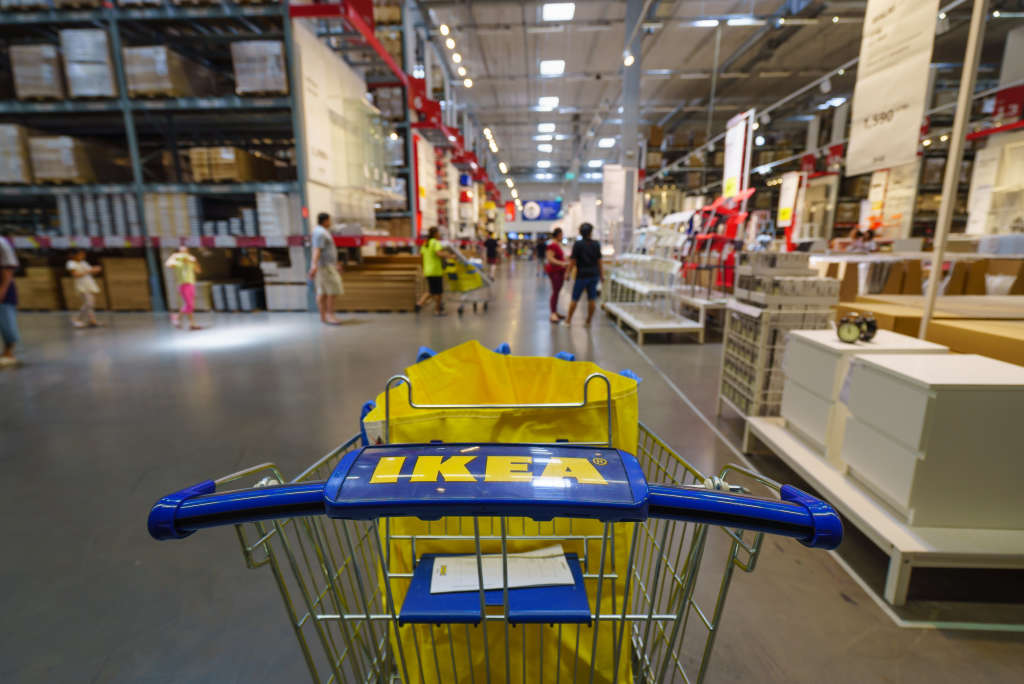
Think about your last trip to IKEA.
还记得你上次逛宜家的经历嘛。
They have the restaurant with, you know, the Swedish meatballs and all of this stuff.
他们有瑞典牛丸以及各种各样美食的餐厅。
And that's not a coincidence.
然而,这并不是什么巧合。
I mean, you're trying to build excitement because when people are excited and aroused they're more likely to buy.
他们是想让顾客兴奋起来,因为人们在兴奋和情绪被调动起来的时候消费的可能性会更大。
Almost 20 percent of our buying decisions are based on logic and needs, 80 percent of our buying decisions are actually based on emotions.
我们的购买决策中有近20%是基于理性和需求的,剩下的80%则是由情绪驱动的。
And we try to make that connection or bridge that connection.
所以,我们会努力建立这种联系,接通这种联系。
Of course, we are retailers, so we try to make sure that, you know, grab a thing or two.
我们毕竟是零售商嘛,所以我们会努力确保顾客们都能买点儿东西走。
So, my name is Richard La Graauw and I'm creative director for Ikea here in the US.
我是理查德·拉·格劳夫,宜家美国这边的创意总监。
Which is an important job.
很重要的一份工作。
He's in charge of how the products are presented in the store.
宜家的产品在商店中如何陈列就归他管。
That includes layout.
包括商品的布局。
Retailers pay close attention to how their floor plan can change in-store behavior.
零售商们非常注重平面规划对顾客进店后的行为的影响。
Grid layouts emphasize speed and convenience.
网格布局强调的是速度和便利性。
Where freeform layouts allow exploration, which can make customers visit more parts of the shop.
自由布局能给消费者提供探索的机会,从而让消费者浏览到更多的板块。
And racetrack designs create a loop that exposes customers to a certain path of product.
赛道设计能创造一种循环,让客户沿着某条路前往某商品处。
IKEA uses a fixed path through a maze of product displays.
宜家则是通过迷宫般的产品展示来设计固定的路径。
That can extend the distance travelled in store.
这样就能延长顾客在店里途经的距离。
So the more you travel, the more items by definition as a shopper you'll be exposed to.
你走过的路越长,作为购物者,你所接触到的商品的数量也就越多。
At the entrance, most customers will be drawn to a bright yellow bin of bags, placed next to the escalator.
在宜家商场的入口处,大多数顾客都会注意到自动扶梯旁的明黄色购物袋。
Spots of light guide your eye to the entrance of the showroom and before you know it, you're taking the scenic route.
接着,光线会引导你的眼睛到达展厅的入口,之后还没等你反应过来,你就已经踏上了宜家的观光之旅。
So with light, you can actually steer consumers towards different areas and toward different product selections.
所以,我们可以通过光线来引导消费者走向不同的区域并选择不同的产品。
On average, customers only visit about a third of any retailer's floor area.
平均而言,客户只会浏览到一家零售商店三分之一的面积。
IKEA's layout forces customers to cover more ground.
但宜家的布局会强迫顾客浏览更多的面积。
IKEA was always designed as a place where you can see, touch, and try, you know?
宜家经常都设计成了一个顾客可以看,可以摸,可以试用的地方,不是吗?
And so they can spend hours if they want to.
所以,只要顾客愿意,逛几个小时都没问题。
But there's also consumers that know exactly what they want and just want to have it quick.
然而,也有一些消费者是明确知道他们要买什么而且想径直快速地购买的。
So it's tailored to both.
两种消费者的需求宜家都能满足。
One researcher in London surveyed an Ikea to hand-draw these pedestrians pathways.
伦敦某研究人员调查了一家宜家,亲手绘制成了这样的步行地图。
This heat map of the showroom was generated using her data.
这一展厅地图是根据她收集到的数据画出来的。
It looks like the path guides are working.
看起来,宜家的路标起作用了。
Where Victor Gruen simply used a hunch to invent window shopping,
维克多·格鲁恩靠直觉就发明了橱窗购物,
virtually any store from IKEA to your local grocery has a trove of big data at their fingertips.
从宜家到你所在的地方的小超市的几乎所有商店手上都有大量的数据可以利用。
We used technology to measure actually the flow of consumers and where they're interested and in which areas they intend to go.
我们会用技术监测顾客人流,他们感兴趣的区域以及他们打算去哪个区域等等。
And that works all based on Beacon technologies.
而这一切都依赖着各种信标技术。
Which means retailers like Ikea will only get better at nudging you to spend time in more parts of the store.
这也就意味着宜家这样的零售商在诱导你在店里停留更长的时间,浏览更多的地方这一方面会做得越来越好。
So, compulsive shoppers, the next time you go to the store, consider taking the shortcut.
所以,购物狂们,下次去商店的时候,不妨考虑考虑走捷径。
Or, at least, don't forget what you came here for.
或者,至少,不要忘记你购物的初衷。
Because it probably wasn't plants and a plate of meatballs.
因为事情可能并没有买点儿绿植或是一盘肉丸那么简单。
You do you though.
但是,决定权还是在你自己啦。


