(单词翻译:单击)
At its Special Event in San Francisco on Monday, Apple offered more detail—including prices and shipping dates—for its highly anticipated Watch. After the keynote, it made the wearable devices available for attendees to evaluate.
周一在旧金山的特别发布会上,千呼万唤的苹果手表终于携各种细节(包括定价和出货日)与广大果粉见面了。在官方演讲结束后,苹果公司向参会者提供了第一时间上手体验的机会。
Never one to shy away from tinkering with shiny—and boy, were the display models shiny—new gadgets, I stayed well past my welcome to thoroughly get a feel for Apple’s Watch.
在这种能够率先体验高科技产品的场合,我向来都是“勇猛精进”,此次也借机彻底地体验了一番苹果手表的感观。

The company will release three different models of the Watch—affordable Sport, mid-tier Watch, and ultra-luxe Edition—the difference among them strictly the material used for the casing.
苹果公司将提供三个版本的苹果手表,首先是价格最亲民的运动版Sport,其次是中端的Watch,再次是奢华版的Watch Edition。但实际上三个版本的区别仅仅是表壳的材料不同。
When I picked them up, there was a slight, yet noticeable difference in their weight, due to the different materials. The Edition, which is available in 18-karat gold, is the heaviest, or so it felt. (Though it may have been the price tag weighing down my arm.) A quick check of the specifications-sheet confirmed my suspicions—the 42mm Edition weighs in at 69 grams, more than double that of the 30-gram Sport model. (For those interested, the stainless-steel Watch weights in at 50 grams.) The weight differences are not significant enough to push you to another Watch model, but they do exist.
把玩这三个版本时,我发现它们的重量略有不同,虽然差别很轻微,但还是能够注意到,这主要是由于这三个版本采用了不同的材料。高端版的Edition使用了18K金材质,也是三个版本中最重的。(或许是因为它咂舌的价格愈发令我手软的缘故。)快速地扫了一眼配置表,我的怀疑也得到了确认。42毫米见方的Edition重约69克,比30克的Sport重了一倍还多。(不锈钢表壳的Watch重约50克。)虽然二三十克的重量差异还不至于让你舍此求彼,但手感上的差异的确是存在的。
When Apple first debuted its Watch in September, the demo area it provided was full of watches we couldn’t use. Each one ran a looping demo that showcased basic features. Those of us in attendance were left with more questions than answers.
去年9月苹果手表首次亮相时,我们对展示区里的手表还只能看,不能摸,每只手表上都循环播放着它的功能演示片。参加过那次发布会的人,对苹果手表的问题恐怕要多过答案。
This time, the operating system on Apple Watch was fully functional, and I made sure to use all of it when I got my paws on them. It was highly responsive, and looked fantastic on the screen. Animations lacked any stuttering or lag, something I saw on the demo units in September. Siri, the voice-prompted virtual assistant, was quick to come up, though the mic had a hard time picking up commands in my noisy environment. Zooming in and out of the Photos library was fun (and rather hypnotic).
这一次,苹果手表上的操作系统对参会者全面放开,上手后我迅速地把几乎所有功能都试了一遍。这款手表的响应性非常好,而且屏幕效果极佳,动画效果没有任何迟滞和卡顿——而这在去年九月的展示环节中还没有完全避免。苹果的语音助手Siri的响应速度也很快,不过由于现场环境比较嘈杂,话筒不太容易领会我的语音指令。在图片库里一张张地看照片的感觉很有意思(而且也相当催眠)。
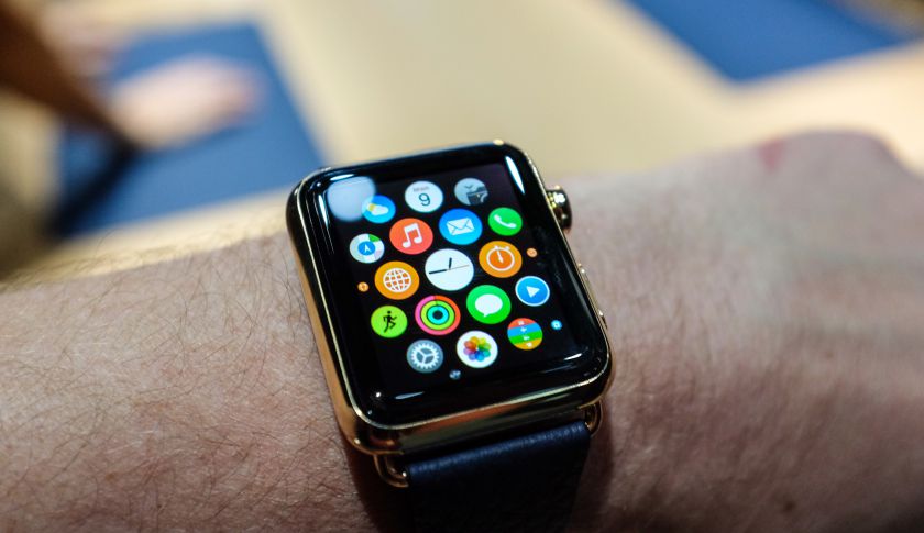
In September, I felt confused by the user interface of the Watch. The collection of round app icons looked small—far too small for what I had come to expect from design-centric Apple. Small screen, small circles, big fingers? It didn’t feel like the usual thinking from Cupertino.
去年九月苹果手表刚问世的时候,它的用户界面一度让我感到困惑。一大堆圆圆的APP图标挤在一块儿,每个看起来都非常小——小到看起来不像是“设计为王”的苹果作品。当小屏幕和小圆圈遇上大手指,那是一种怎样的纠结?看起来不像苹果一惯的作风。
But the Apple Watch relies heavily on its so-called digital crown as a way to take pressure off the finger as a primary method of input. Now that I’ve been able to actually use it—to zoom in on a section of app icons, for example, consequently enlarging them—the experience suddenly became very Apple-like. The crown was easy to turn, with a little resistance, but not too much.
不过苹果手表其实高度依赖它所谓的“数字表冠”旋钮(digital crown),以此减轻手指作为主要输入方式的压力。现在我已经会用它了,比如用来放大APP的图标,然后你就突然有了非常“苹果范儿”的感觉。虽然初次上手有点不适应,但熟悉起来其实也很简单。
Force Touch, Apple’s new method of pressing harder on the screen to activate what equates to a right-click of sorts, will take some getting used to. Figuring out when to use it, and for what, wasn’t always clear to me. When I pressed hard on the watch face, I activated the customization menu—neat, but there’s nothing to on the device to indicate (other than tutorials provided by Apple) that there is extra functionality hidden under your fingertip.
苹果手表的另一项新功能叫做“Force Touch”,需要你的手指施加一点力度按压在屏幕上,效果相当于在电脑上点击鼠标右键,这个功能则需要用户花一点时间来适应。我也经常搞不清楚什么时候该使用这个功能,以及这个功能究竟能做什么。我用力按了一下表盘,结果激活了定制菜单——虽然很巧妙,但是这款设备上没有任何一处暗示你,手指用力一按还能激活它的隐藏功能(除了苹果提供的使用指南)。
I also struggled with the idea that pushing in on the Digital Crown acts as a back button. There’s a near-flush button positioned just adjacent to the Digital Crown, but it offers little in the form of functionality, as far as I could tell, outside of the home screen or watch face on the Watch. (A single- or double-press triggers Apple Pay or displays your favorite contacts for Apple’s cute Watch messaging app. Which, by the way, looks like a gimmick on stage but in practice comes across as a practical means of quickly communicating.) My fingertip seemed to want “back” to come in a more conventional form.
另外一个令我挠头的理念,则是把“数字表冠”旋钮当成后退键使用,我的手指还是想通过更传统的方式实现“后退”功能。此外,就在表冠旁边,还有一个与外壳近乎齐平的按钮,但它除了可以充当Home键之外,只有很少几项其它功能。(比如单击或双击可以触发苹果支付功能,或显示消息应用的常用联系人。顺便说一句,后者在台上看起来很花哨,但实际上我发现对于快速沟通很实用。)
The Watch comes with 8 gigabytes of storage, Apple representatives told me. I took a sneak peak in the Settings section of the Watch and discovered that, after accounting for space requirements of the operating system, you’re left with 5.9 gigabytes of space. This leftover space is where you can store your music, photos, and Watch apps. It’s not a lot, but then again, how much music do you really need to have on your wrist? It’s more than enough for a playlist or two to power you through a workout, though persnickety long-distance runners may object.
苹果公司的代表告诉我,苹果手表自带8G内存。我忙里偷闲地看了一眼设备的设置,发现除去操作系统占用的空间以外,你只剩下了5.9G的内存空间可以用来储存音乐、照片和应用。虽然听起来不多,但话说回来,作为一款手表,你打算往里面存多少音乐呢?这么大的空间能够储存的音乐足够你健身的时候听了,不过有些长跑爱好者估计还是觉得稍嫌不足。
A bit of good news for those who follow Apple rumors: Any Watch band can be used with any Watch. (So long as it’s built for the size of watch you own: A 42mm band won’t fit on a 38mm Watch, and vice-versa.) Before the event, rumors swirled that select bands would only be available for select models—a sort of economic segregation. That’s not actually the case.
对果粉来说,另一个好消息是:任何一个版本的苹果手表都可以搭配任意一款你心仪的表链。(只要表链/表带符合你所购买版本的尺寸——42mm的表链不适合38mm的手表,反之亦然。)在发布会前,有传言称高档表链只会出现在高档版本中——听起来似乎给果粉也划分了阶级,好在这种说法并不是真的。
So how do I feel about Apple’s next great gadget? My somewhat brief time with the Watch left me feeling excited and hopeful. It’s clear that Apple thought through every aspect of the first new product released under Tim Cook; there are small, thoughtful features throughout (such as the ability to receive alerts on your Watch when outside of Bluetooth range when both your iPhone and Watch are on the same Wi-Fi network) that demonstrate this.
如果你问我,对苹果这款新品的感觉如何?应该说,这次我与苹果手表的接触时间虽短,但我依然觉得很兴奋并充满期待。作为库克时代发布的第一款真正意义上的新品,苹果显然考虑到了这款产品的方方面面。比如它自始至终都贯穿着一些非常体贴的小功能。(比如如果你戴着手表超出了iPhone的蓝牙距离,只要手表和iPhone还处在同一个Wi-Fi网络中,它仍然可以收到提醒信息。)
Pebble and, to a lesser extent, Google’s Android Wear clearly laid the groundwork for the smart watch industry as we know it today. Apple’s offering is a big step toward its maturation, and the company is positioned to propel a budding category into another iPhone-like gold rush. Competitors know how high the bar has been set. Now, they just need to figure out how to compete.
Pebble以及谷歌的Android Wear显然为今天的智能手表行业奠定了基石,而苹果手表的上市则意味着智能手表产业向成熟迈进了一大步。与此同时,苹果公司也准备将这个初露头角的产品类别发展成为另一棵堪比iPhone的摇钱树。竞争对手深深感受到了苹果为智能手表领域设定的高门槛。现在,他们最需要搞清的是如何与苹果进行竞争。


