(单词翻译:单击)
You probably know how this symbol is supposed to make you feel. And this one. This one too, even if you’re not sure exactly what it means.
大家可能知道这个符号应该给大家带来怎样的感受,还有这个,这个,尽管大家可能并不很清楚它们的意思。
But what about this? This symbol — The Jolly Roger — was once one of the most feared symbols in the world.
那这个呢?这个符号——海盗旗的符号——曾经是世界上最令人闻风丧胆的符号之一。
It represented death, pirates, and poison.
它代表着死亡、海盗和毒药。
But today, it’s associated more with treasure, blockbuster movies, or Halloween than actual danger.
然而今天,这一符号更多的是和宝藏、叫座大片或者万圣节,而不是实实在在的危险联系在一起。
We are surrounded by icons that warn us: what to stay away from, what not to do, what to be afraid of.
我们身边不乏各种各样的警示标志,告诉我们要远离什么,不能做什么,要害怕什么。
But how do you design a symbol in a way that will last across generations and languages?
然而,这些标志要如何设计才能跨越年代,跨越语言障碍呢?
It turns out that is an incredibly hard thing to do.
事实表明,要做到这一点困难无比。
Back in the early 20th century, there was an urgent need for a new kind of warning symbol.
20世纪早期,人们急需一种新型警告标志。
At the time, there was no universal standard for communicating the presence of dangerous biological materials.
因为那时没有表示有危险性生物材料的通用标志。
Laboratories at the US Army used an inverted blue triangle. Those at the Navy used a pink rectangle.
比如美国陆军实验室使用的是蓝色倒三角图标,海军实验室使用的则是粉红色矩形标志。
The Universal Postal Convention used a white staffandsnake on a violet background.
万国邮联使用的又是紫罗兰背景的白色权杖和蛇形图标。
There was no consistency in the visual language used to communicate risk.
总之,那时没有沟通风险的统一视觉语言。
That was dangerous, and could lead to accidental infections.
这是非常危险的,因为可能会造成意外感染。
So in 1966, a group of engineers and designers at Dow Chemical set out to create the best possible icon for biohazardous materials.
所以,1966年,陶氏的工程师和设计师开始想办法设计最能提示有生物危害性材料的标志。
They laid out six design criteria.
他们提出了六条设计准则。
First, it needed to be visually striking, so that it would draw immediate attention.
一,标志要有视觉震慑力,能够瞬时抓住路人的注意力。
That ruled out simple shapes like those from the Navy and Army.
这一要求就排除了美国海军和陆军实验室使用的那种简单符号。
It also had to be unique and unambiguous, in order not to be confused with symbols used for other purposes.
其次,标志要有独特性并且清楚明了,以免与其他用途的标志混淆。
That ruled out the snakeandstaff, which has multiple versions and has a pretty vague meaning as a general symbol for medicine.
这第二条又排除了蛇和手杖的标志,因为这一标志有多个版本,还经常被用作医药的标志。
On top of that, it had to be quickly recognizable and easily recalled. Had to be easy to stencil. And rotationally symmetrical, in order to appear identical from all angles.
最重要的是,第三,标志要被能迅速识别,迅速回忆起来;第四,标志要方便印刷;第五,标志要高度对称,以便能从各个角度都能识别。
And lastly, it had to be acceptable to groups of all backgrounds.
最后,标志要能得到不同背景的人的一致认可。
So the Dow Chemical team designed an experiment.
于是陶氏团队设计了一个实验。
Charles Baldwin, an environmental health engineer behind the experiment,
负责该实验的环境卫生工程师查尔斯·鲍尔温说,
said that the team “wanted something that was memorable but meaningless so we could educate people as to what it means.“
他们“想做一个好记但又没有明确意义的标志,这样我们才好给大家普及它的意思。”
They showed a set of 24 symbols to 300 people from 25 American cities.
他们给分别来自美国25个城市的300名受试者展示了24个标志。
There were 6 newly-designed biohazard markers,
其中包括6个新设计的生物危害标志,
and 18 common symbols — things like Mr.Peanut, the Texaco star, the Shell Oil symbol, the Red Cross, and a swastika.
和18个普通标志——比如花生先生、德士古星、壳牌标志、红十字和纳粹万字符。
Participants were asked to guess the meaning of each one, which was used to assign each one a “meaningfulness score.”
受试者被要求猜测每个标志的意思,并且就其意义程度进行打分。
A week later, the same participants were shown those original 24 symbols, plus 36 more.
一周后,这些受试者再次接到了原来的24种标志,还多了36种。
They were asked to identify which symbols they remembered seeing in the previous round of the study.
他们被要求指出在先前的实验中看过的标志。
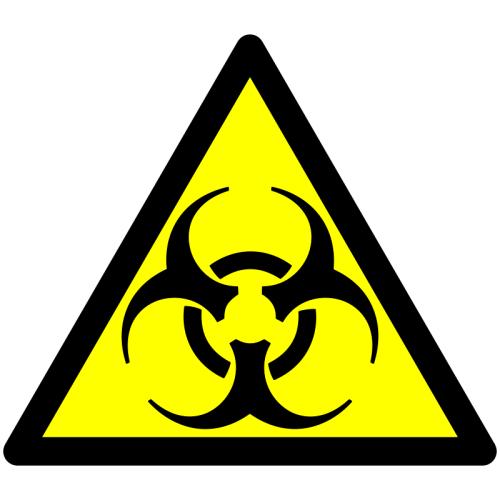
Among the six competing biohazard designs, this one stood out.
在六个备选的生物危害标志中,这一个尤为突出。
It scored the highest in memorability, but the lowest in meaningfulness.
因为这一符号最容易被记住,意义也最不明确。
So it was unforgettable, but also a totally blank slate for designers who wanted to give it meaning.
所以这个标志是不容易被忘记的,其意义也是一片空白,设计师们就可以赋予它新的意义了。
And with that, it became a national standard.
这一标志就这样成了美国各地通用的生物危害标志。


