(单词翻译:单击)
Every Presidential Election Year, there is this one visual aid that we see over and over again.
每次总统大选,我们都会反反复复反反复复看到一张选举情况的直观图。
Show me that Mitt Romney map. Look at that map.
麻烦帮我打开米特·罗姆尼选票地图,我们来看看这张地图。
Let's go back to the 2000 map.
我们不妨回到2000年时的地图上。
And it is in dire need of a redesign.
这个地图迫切需要重新设计。
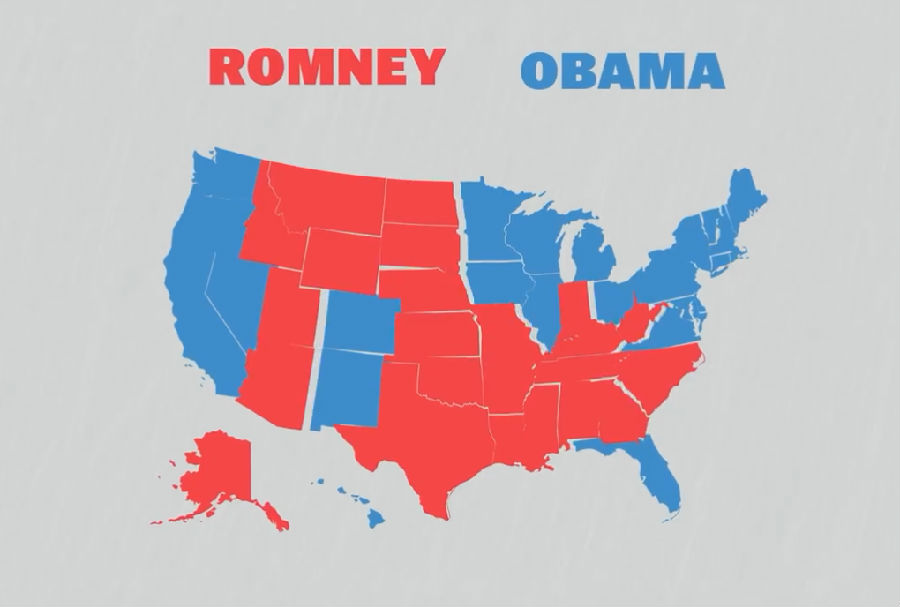
Just look at this map. It's not just unhelpful, it's actually misleading.
看看这张地图,它不仅无法帮我们了解选票情况,还会让人产生误解。
It shows the states that Mitt Romney and Barack Obama won in 2012.
这张图显示的是2012年米特·罗姆尼和奥巴马两人赢得的选票情况。
Without more information it's really hard to tell that Obama actually won.
在没有更多资料的情况下,我们很难从这张地图上看出来奥巴马才是赢得选举的那一方。
He beat Romney by more than a hundred electoral votes.
他比罗姆尼的选票多出了一百多票。
So, while this map does a great job telling you that Romney won Montana, for example,
所以,尽管这张地图能清楚地告诉大家罗姆尼赢了……比如蒙大拿吧,
what it doesn't tell you is how much that victory doesn't matter.
却不能告诉大家这一胜利并没有多大意义。
That's because montana only gets three electoral votes.
那是因为蒙大拿州只有三枚选票。
Massachusetts gets four times as many, and you can barely find it on the map.
而马萨诸塞州的选票是蒙大拿的四倍之多,大家却根本无法从地图上看出这一差异。
That's because the people who made this map made a choice.
这是因为涉及这张地图的人做了一个选择。
They chose to prioritize geographic accuracy over electoral importance.
他们选择了保证地理位置的准确性,而非各州选票的重要性。
And geographically accurate maps are great for road trips,
然而,地理位置准确的地图固然有利于车辆行驶,
but they don't do a very good job telling us the country voted.
却无法很好地说明这个国家选举的情况。
So, some designers have tried other solutions.
所以,部分地图设计师们提出了其他方案。
They're making different maps called cartograms.
他们设计出了各种各样的统计地图。
These maps distort the state's shape so that their physical size corresponds not with their geographic boundaries,
这些地图舍弃了各州的地理形状,各州的大小并非要与它们的地理边界一致,
but with the number of electoral votes they get.
而是要与选票数量一致。
Here's a version designed by the New York Times, with each state scaled by electoral votes.
下面是《纽约时报》设计的版本,地图中每个州的大小由选票数量决定。
They've ditched the precise borders of each state in favor of squares,
这些地图去掉了各个州的精确边界,转而用矩形来表示各州,
but still arranged them geographically, so it's easy enough to find your own state.
但各州的位置仍按其地理位置来安排,所以大家很容易就能找出自己所在的州。
Another approach from the Daily Kos, makes room to report the popular vote from each congressional district.
《科斯日报》设计的地图还标出了每个国会选取受欢迎一方的选票情况。
But so far these ideas haven't been widely adopted.
然而,到目前为止,这些方案都还没有得到广泛应用。
So does this mean that we're stuck with bad maps for another election cycle? Not necessarily.
这是否意味着下一个选举年我们还要使用那些糟糕的地图呢?不一定。
There are so many different ways to visualize information.
我们有很多种可视化选票信息的方法。
Why not show a list of states? Or a series of bar charts?
为什么不把各个州做成一个列表或者做一系列条形图呢?
All of these methods tell you so much more than those ubiquitous red state, blue state maps.
任何一种方法都远远好过那些无处不在又只用红色和蓝色标示的地图。


